A Complete GWAS Practical Tutorial Using PLINK, GCTA, R, and METAL

From Genotype QC to Association Testing and Meta-analysis

Genetics
GWAS
Statistical Genetics
Tutorial
A full walkthrough of a GWAS pipeline – QC, PCA, mixed-model association testing, meta-analysis, and relatedness – with runnable simulations illustrating each key statistical concept.
Author

Nivedita Bhadra

Published

June 8, 2026

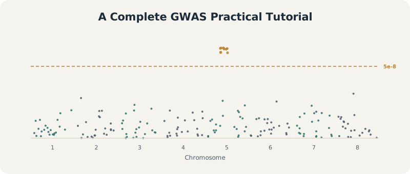
Stylized Manhattan plot illustrating genome-wide association results across chromosomes, with one simulated significant locus

A Manhattan plot: each point is a SNP, plotted by genomic position (x-axis) and significance (y-axis). Towers that cross the genome-wide threshold are the signals a GWAS is built to find.

PLINK GCTA METAL R Population Genetics

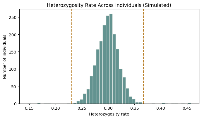
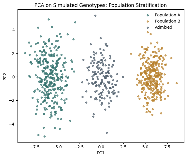
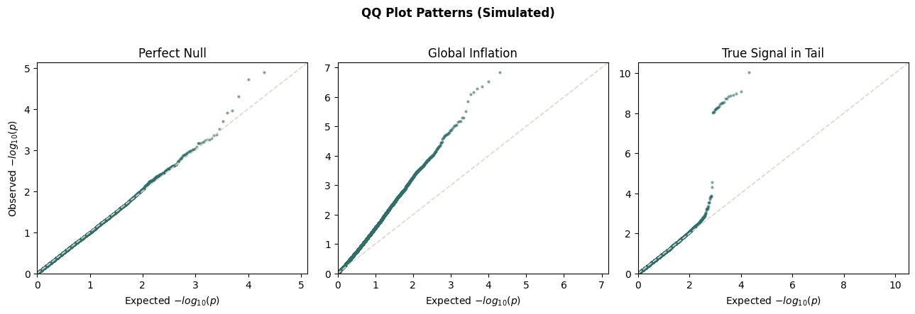
A note on how to use this tutorial. PLINK, GCTA, and METAL are external command-line tools – install them separately and run the shown commands against your own genotype files. They are not part of this notebook’s Python kernel and are not executed here. To make the core statistical concepts concrete without requiring real genotype data, several sections include small, genuinely executed Python simulations (clearly marked) that reproduce the shape of the real output – a heterozygosity distribution, a stratified PCA plot, QQ plot patterns, a Manhattan plot, and a GRM heatmap – using synthetic data, not results from the commands above.

Genome-wide association studies, or GWAS, are used to identify genetic variants associated with traits or diseases.

A GWAS usually tests hundreds of thousands to millions of SNPs across the genome.

For each SNP, we ask:

Is genetic variation at this SNP statistically associated with the phenotype?

In this tutorial, we walk through a complete GWAS workflow using:

The goal is not only to run commands, but to understand why each step matters.

0.0.1 What You Will Learn

  • How to prepare genotype and phenotype files for GWAS
  • How to perform sample and SNP quality control with PLINK
  • How to compute principal components and build a GRM
  • How to run mixed-model GWAS with GCTA fastGWA
  • How to visualize results with QQ and Manhattan plots
  • How to perform a simple meta-analysis with METAL
  • How to inspect relatedness and heterozygosity in GWAS data

0.0.2 Who Should Read This Tutorial

This tutorial is intended for researchers and students who want a practical GWAS workflow using standard tools in statistical genetics. Prior experience with command-line tools, PLINK, and basic genomics concepts is helpful but not required.

0.0.3 Overview of the GWAS Pipeline

The complete workflow is:

  1. Prepare genotype and phenotype files
  2. Perform genotype quality control
  3. Remove low-quality SNPs
  4. Remove low-quality individuals
  5. Check heterozygosity outliers
  6. Compute principal components
  7. Build a genetic relationship matrix
  8. Run GWAS without PC adjustment
  9. Run GWAS with PC adjustment
  10. Compare QQ plots and Manhattan plots
  11. Meta-analyze two GWAS results
  12. Inspect heterogeneity
  13. Identify the top SNP
  14. Inspect relatedness using the GRM

0.0.4 Why Quality Control is Necessary?

Before running GWAS, we must clean the genotype data.

Poor genotype quality can create false associations.

Common problems include:

  • SNPs missing in many individuals
  • Individuals missing many genotypes
  • Very rare variants with unstable estimates
  • SNPs violating Hardy-Weinberg equilibrium
  • Sample contamination
  • Inbreeding
  • Unexpected relatives
  • Population stratification

A GWAS is only as reliable as the data used to run it.

0.0.5 Data Used in This Tutorial

We assume two simulated studies:

study1.bed
study1.bim
study1.fam

study2.bed
study2.bim
study2.fam

study1_pheno.txt
study2_pheno.txt

study1_covariates.txt
study2_covariates.txt

Each study contains:

  • around 2,000 individuals
  • around 50,000 SNPs
  • one phenotype
  • covariates including sex, age, and PCs

0.0.7 Create Working Directory

mkdir GWAS
cd GWAS
# Place your own study1.{bed,bim,fam}, study2.{bed,bim,fam},
# phenotype (study1_pheno.txt, study2_pheno.txt), and
# covariate (study1_covariates.txt, study2_covariates.txt) files here.

Check files:

ls

Inspect the genotype files:

head study1.fam
head study1.bim

Inspect phenotype and covariate files:

head study1_pheno.txt
head study1_covariates.txt

0.0.8 Question: Is the Phenotype Quantitative or Case-Control?

Look at the phenotype file:

head study1_pheno.txt

If the phenotype is continuous, such as height, BMI, or simulated trait value, then it is quantitative.

If the phenotype is coded as 0/1 or 1/2 for disease status, then it is case-control.

In this practical, the phenotype is treated as a quantitative phenotype because fastGWA is run using a linear mixed model.

0.0.8.1 Software Used

We use:

Tool Purpose
PLINK 1.9 QC and genotype processing
GCTA GRM construction and fastGWA
R Plotting and file preparation
qqman QQ plots and Manhattan plots
METAL Meta-analysis

2 Plot Heterozygosity in R

Switch to R.

setwd("YOUR_WORKING_DIRECTORY")

het <- read.table("study1_het.het", header = TRUE)

het$het_rate <- (het$N.NM. - het$O.HOM.) / het$N.NM.

hist(
  het$het_rate,
  breaks = 50,
  main = "Heterozygosity Rate",
  xlab = "Heterozygosity"
)

upper <- mean(het$het_rate) + 3 * sd(het$het_rate)
lower <- mean(het$het_rate) - 3 * sd(het$het_rate)

abline(v = upper, col = "red", lty = 2)
abline(v = lower, col = "red", lty = 2)

3 Identify Heterozygosity Outliers

outliers <- het[
  het$het_rate < lower | het$het_rate > upper,
  c("FID", "IID")
]

cat("Heterozygosity outliers:", nrow(outliers), "\n")

write.table(
  outliers,
  "study1_het_outliers.txt",
  row.names = FALSE,
  col.names = FALSE,
  quote = FALSE,
  sep = "\t"
)

4 Remove Heterozygosity Outliers

Back in the terminal:

plink --bfile study1_qc_mind \
  --remove study1_het_outliers.txt \
  --make-bed \
  --out study1_qc

Now study1_qc is the final QC’d Study 1 dataset.

5 Step 1.7: Summarize QC Results

Check final SNP and individual counts:

plink --bfile study1_qc \
  --freq \
  --out study1_qc_freqs

You should summarize:

QC Step Output Prefix What Was Removed
Raw data study1 None
SNP missingness study1_geno SNPs with missingness > 2%
MAF filter study1_maf SNPs with MAF < 1%
HWE filter study1_qc_snps SNPs with HWE p < 1e-6
Individual missingness study1_qc_mind Individuals with missingness > 2%
Heterozygosity study1_qc Heterozygosity outliers

6 Repeat QC for Study 2

Now repeat the same commands for Study 2.

7 Study 2: Overview

plink --bfile study2 --freq --out study2_freqs

8 Study 2: SNP Missingness

plink --bfile study2 --missing --out study2_miss
head study2_miss.lmiss
plink --bfile study2 \
  --geno 0.02 \
  --make-bed \
  --out study2_geno

9 Study 2: MAF Filtering

plink --bfile study2_geno \
  --maf 0.01 \
  --make-bed \
  --out study2_maf

10 Study 2: HWE Filtering

plink --bfile study2_maf \
  --hwe 1e-6 \
  --make-bed \
  --out study2_qc_snps

11 Study 2: Individual Missingness

plink --bfile study2_qc_snps \
  --mind 0.02 \
  --make-bed \
  --out study2_qc_mind

12 Study 2: Heterozygosity

plink --bfile study2_qc_mind \
  --het \
  --out study2_het

In R:

het2 <- read.table("study2_het.het", header = TRUE)

het2$het_rate <- (het2$N.NM. - het2$O.HOM.) / het2$N.NM.

hist(
  het2$het_rate,
  breaks = 50,
  main = "Study 2 Heterozygosity Rate",
  xlab = "Heterozygosity"
)

upper2 <- mean(het2$het_rate) + 3 * sd(het2$het_rate)
lower2 <- mean(het2$het_rate) - 3 * sd(het2$het_rate)

abline(v = upper2, col = "red", lty = 2)
abline(v = lower2, col = "red", lty = 2)

outliers2 <- het2[
  het2$het_rate < lower2 | het2$het_rate > upper2,
  c("FID", "IID")
]

cat("Study 2 heterozygosity outliers:", nrow(outliers2), "\n")

write.table(
  outliers2,
  "study2_het_outliers.txt",
  row.names = FALSE,
  col.names = FALSE,
  quote = FALSE,
  sep = "\t"
)

Back in terminal:

plink --bfile study2_qc_mind \
  --remove study2_het_outliers.txt \
  --make-bed \
  --out study2_qc

Check final Study 2 data:

plink --bfile study2_qc \
  --freq \
  --out study2_qc_freqs
# Illustrative simulation -- NOT real output from the commands above.
# Reproduces the shape of a typical study1_het.het heterozygosity distribution
# and the +/- 3 SD outlier rule described in the text.

import numpy as np
import matplotlib.pyplot as plt

rng = np.random.default_rng(42)

n = 2000
het_rate = rng.normal(0.30, 0.02, n)
outlier_idx = rng.choice(n, 15, replace=False)
het_rate[outlier_idx] += rng.choice([-1, 1], 15) * rng.uniform(0.08, 0.15, 15)

mean_h, sd_h = het_rate.mean(), het_rate.std()
upper, lower = mean_h + 3 * sd_h, mean_h - 3 * sd_h
outliers = np.where((het_rate > upper) | (het_rate < lower))[0]

fig, ax = plt.subplots(figsize=(7, 4.2))
ax.hist(het_rate, bins=50, color="#2f6f6b", alpha=0.75, edgecolor="#fbfaf7")
ax.axvline(upper, color="#b9812c", linestyle="--", linewidth=1.6)
ax.axvline(lower, color="#b9812c", linestyle="--", linewidth=1.6)
ax.set_title("Heterozygosity Rate Across Individuals (Simulated)")
ax.set_xlabel("Heterozygosity rate")
ax.set_ylabel("Number of individuals")
plt.tight_layout()
plt.show()

print(f"Flagged {len(outliers)} heterozygosity outliers out of {n} individuals")

Flagged 15 heterozygosity outliers out of 2000 individuals

12.0.1 QC Interpretation

At the end of QC, we should ask:

  1. How many SNPs were removed due to missingness?
  2. How many SNPs were removed due to low MAF?
  3. How many SNPs were removed due to HWE deviation?
  4. How many individuals were removed due to missingness?
  5. How many individuals were removed due to heterozygosity outliers?
  6. Are the remaining sample sizes reasonable?
  7. Are the remaining SNP counts reasonable?

12.0.2 Why This QC Pipeline Matters

Skipping SNP missingness filtering can leave unreliable variants.

Skipping MAF filtering can produce unstable rare-variant tests.

Skipping HWE filtering can leave genotyping artifacts.

Skipping individual missingness filtering can leave poor-quality samples.

Skipping heterozygosity checks can leave contaminated or inbred samples.

In GWAS, even small QC problems can create genome-wide false positives.

12.0.3 End of Part 1

At this point we have:

  • inspected genotype files
  • computed allele frequencies
  • removed poorly genotyped SNPs
  • removed rare variants
  • removed HWE outliers
  • removed low-quality individuals
  • removed heterozygosity outliers
  • produced final QC’d datasets:
study1_qc
study2_qc

Next we will compute principal components to detect and correct population structure.

12.1 Part 2: Principal Components Analysis (PCA) and Population Stratification

12.1.0.1 Why Do We Need PCA?

Suppose we perform a GWAS for a disease.

Imagine:

  • Group A has ancestry from Northern Europe
  • Group B has ancestry from Southern Europe

Now suppose:

  • Disease prevalence differs between groups
  • Allele frequencies differ between groups

A SNP can appear associated with disease simply because ancestry differs.

This creates a false positive association.

This phenomenon is called:

12.1.1 Population Stratification

Population stratification is one of the largest sources of false positives in GWAS.

A GWAS can produce apparently significant associations even when no causal effect exists.

12.1.1.1 Example

Suppose:

Population Disease Rate Allele Frequency
Population A 10% 0.20
Population B 40% 0.80

Even if the SNP has nothing to do with disease:

  • cases contain more individuals from Population B
  • controls contain more individuals from Population A

The SNP becomes associated with disease.

The association is completely spurious.

13 How PCA Helps

Principal Components Analysis identifies major axes of genetic variation.

Instead of looking at:

50,000 SNPs

we summarize ancestry using:

PC1
PC2
PC3
...
PC10

These PCs can then be included as covariates in the GWAS model.

The PCs absorb ancestry differences.

This dramatically reduces false positives.

14 Mathematical Intuition

Suppose our genotype matrix is:

\[ X \]

with dimensions:

\[ N \times M \]

where:

  • N = individuals
  • M = SNPs

For example:

\[ 2000 \times 50000 \]

PCA decomposes the genotype matrix into orthogonal directions of variation.

Mathematically:

\[ X = UDV^T \]

where:

  • U contains individual scores
  • D contains singular values
  • V contains SNP loadings

The first principal component captures the largest source of genetic variation.

Often:

  • PC1 reflects ancestry
  • PC2 reflects ancestry
  • PC3 reflects finer population structure
# Illustrative simulation -- NOT real output from PLINK --pca.
# Simulates genotypes for two diverged populations plus an admixed group,
# to make the "How PCA Helps" discussion above concrete.

import numpy as np
import matplotlib.pyplot as plt
from sklearn.decomposition import PCA

rng = np.random.default_rng(42)
n_per_group, n_snps = 300, 300

def simulate_genotypes(n_ind, n_snps, allele_freqs):
    return rng.binomial(2, allele_freqs, size=(n_ind, n_snps))

freqs_pop_a = rng.uniform(0.05, 0.5, n_snps)
freqs_pop_b = np.clip(freqs_pop_a + rng.normal(0, 0.25, n_snps), 0.01, 0.99)
freqs_admixed = (freqs_pop_a + freqs_pop_b) / 2

geno_a = simulate_genotypes(n_per_group, n_snps, freqs_pop_a)
geno_b = simulate_genotypes(n_per_group, n_snps, freqs_pop_b)
geno_admixed = simulate_genotypes(150, n_snps, freqs_admixed)

geno = np.vstack([geno_a, geno_b, geno_admixed])
labels = (["Population A"] * n_per_group + ["Population B"] * n_per_group +
          ["Admixed"] * 150)

geno_std = (geno - geno.mean(axis=0)) / (geno.std(axis=0) + 1e-8)
pcs = PCA(n_components=2).fit_transform(geno_std)

fig, ax = plt.subplots(figsize=(6.5, 5.5))
colors = {"Population A": "#2f6f6b", "Population B": "#b9812c", "Admixed": "#4a5a68"}
for grp in ["Population A", "Population B", "Admixed"]:
    mask = np.array(labels) == grp
    ax.scatter(pcs[mask, 0], pcs[mask, 1], s=18, alpha=0.7, color=colors[grp], label=grp)
ax.set_title("PCA on Simulated Genotypes: Population Stratification")
ax.set_xlabel("PC1")
ax.set_ylabel("PC2")
ax.legend(frameon=False)
plt.tight_layout()
plt.show()

15 Why LD Pruning is Necessary

Before PCA we must remove highly correlated SNPs.

Otherwise:

  • large LD blocks dominate the PCA
  • certain chromosomes become overrepresented
  • ancestry signals become distorted

Therefore we first perform:

15.1 LD Pruning

16 Linkage Disequilibrium Refresher

Linkage disequilibrium (LD) measures correlation between nearby SNPs.

For two SNPs:

\[ r^2 \]

measures their correlation.

Values:

Interpretation
0 Independent
1 Perfect correlation

PCA works best when SNPs are approximately independent.

17 Step 2.1 LD Pruning

Run:

plink --bfile study1_qc \
      --indep-pairwise 50 5 0.2 \
      --out study1_prune

18 Understanding the Command

--indep-pairwise 50 5 0.2

means:

Parameter Meaning
50 Window size
5 Step size
0.2 r² threshold

PLINK:

  1. examines 50 SNP windows
  2. shifts by 5 SNPs
  3. removes SNPs with:

\[ r^2 > 0.2 \]

19 Output Files

study1_prune.prune.in
study1_prune.prune.out

19.0.1 SNPs Retained

wc -l study1_prune.prune.in

These SNPs will be used for PCA.

19.0.2 SNPs Removed

wc -l study1_prune.prune.out

These SNPs were excluded because of LD.

20 Why Not Use All SNPs?

Imagine a chromosome region containing:

500 highly correlated SNPs

Without pruning:

  • that region contributes 500 times
  • another region contributes only once

The PCA becomes biased.

LD pruning gives each genomic region approximately equal influence.

21 Step 2.2 Compute Principal Components

Now compute PCs using only pruned SNPs.

plink --bfile study1_qc \
      --extract study1_prune.prune.in \
      --pca 10 \
      --out study1_pca

22 Output Files

study1_pca.eigenvec
study1_pca.eigenval

The eigenvectors contain PC scores.

Inspect:

head study1_pca.eigenvec

Example:

FID IID PC1 PC2 PC3 ...

Each row represents one individual.

22.0.1 Variance Explained

Inspect:

cat study1_pca.eigenval

The first eigenvalue corresponds to:

PC1

The second eigenvalue corresponds to:

PC2

Larger eigenvalues indicate stronger axes of variation.

22.0.1.1 Visualizing Principal Components

Switch to R.

pcs <- read.table(
  "study1_pca.eigenvec",
  header = FALSE
)

colnames(pcs) <- c(
  "FID",
  "IID",
  paste0("PC",1:10)
)

23 PC1 vs PC2

plot(
  pcs$PC1,
  pcs$PC2,
  xlab="PC1",
  ylab="PC2",
  main="Study 1: PC1 vs PC2",
  pch=20,
  col="steelblue"
)

24 Interpretation

Each point is one individual.

Individuals close together are genetically similar.

Individuals far apart are genetically different.

25 Possible Outcomes

25.1 Scenario 1: Single Cloud

*******
*********
*******

Interpretation:

  • relatively homogeneous population
  • little population structure

25.2 Scenario 2: Two Clusters

****      ****
****      ****

Interpretation:

  • two ancestry groups
  • strong population stratification

25.3 Scenario 3: Gradient

****
  ****
      ****

Interpretation:

  • continuous ancestry variation
  • admixture

25.3.0.1 Real Example

If we analyzed:

  • Europeans
  • Africans
  • East Asians

PC1 and PC2 often separate groups almost perfectly.

The resulting plot contains three distinct clusters.

25.3.1 Quantifying Variance Explained

Create a scree plot.

eig <- scan(
  "study1_pca.eigenval"
)

var_exp <- eig/sum(eig)

plot(
  var_exp,
  type="b",
  pch=19,
  xlab="Principal Component",
  ylab="Variance Explained",
  main="Scree Plot"
)

25.3.2 Interpretation

Usually:

  • PC1 explains most variance
  • PC2 explains less
  • later PCs explain progressively less

A sharp drop indicates the important ancestry dimensions.

25.3.3 Visualizing Multiple PCs

PC1 vs PC3:

plot(
  pcs$PC1,
  pcs$PC3,
  pch=20,
  col="darkgreen",
  xlab="PC1",
  ylab="PC3"
)

PC2 vs PC3:

plot(
  pcs$PC2,
  pcs$PC3,
  pch=20,
  col="firebrick",
  xlab="PC2",
  ylab="PC3"
)

Sometimes structure only appears in later PCs.

25.3.4 Why PCs Become Covariates

Suppose:

\[ Y \]

is phenotype.

Instead of fitting:

\[ Y = SNP \]

we fit:

\[ Y = SNP + Age + Sex + PC1 + PC2 + ... + PC10 \]

The PCs absorb ancestry effects.

This reduces false associations.

25.3.5 How Many PCs Should Be Used?

Common choices:

Dataset Typical PCs
Small GWAS 5–10
UK Biobank 10–20
Highly diverse cohort 20–40

There is no universal answer.

Researchers often inspect scree plots and genomic inflation.

26 PCA and Relatedness

Close relatives can distort PCA.

For example:

  • siblings
  • parent-child pairs
  • cousins

may create artificial clusters.

Best practice:

  1. Identify unrelated individuals.
  2. Compute PCs on unrelateds.
  3. Project PCs onto relatives.

Tools commonly used:

  • PLINK2
  • flashPCA
  • EIGENSOFT

For this practical we compute PCs directly because the number of relatives is small.

27 Repeat PCA for Study 2

Perform the same steps.

LD pruning:

plink --bfile study2_qc \
      --indep-pairwise 50 5 0.2 \
      --out study2_prune

Compute PCs:

plink --bfile study2_qc \
      --extract study2_prune.prune.in \
      --pca 10 \
      --out study2_pca

Plot:

pcs2 <- read.table(
  "study2_pca.eigenvec",
  header=FALSE
)

colnames(pcs2) <- c(
  "FID",
  "IID",
  paste0("PC",1:10)
)

plot(
  pcs2$PC1,
  pcs2$PC2,
  pch=20,
  col="darkorange",
  xlab="PC1",
  ylab="PC2",
  main="Study 2: PC1 vs PC2"
)

28 Summary

In this section we learned:

  1. Population stratification creates false positive GWAS hits.
  2. PCA identifies ancestry differences.
  3. LD pruning is required before PCA.
  4. Principal components summarize genetic variation.
  5. PC1 and PC2 often represent ancestry.
  6. PCs are added as covariates in GWAS.
  7. PCA substantially reduces confounding.

At this point we have:

  • QC’d genotype data
  • ancestry estimates
  • principal components

Next we will build a Genetic Relationship Matrix (GRM) and run a mixed-model GWAS using GCTA fastGWA.

29 Part 3: Genetic Relationship Matrices (GRMs) and Mixed-Model GWAS with GCTA fastGWA

30 Why Ordinary GWAS Can Fail

Suppose we perform a simple GWAS.

For each SNP we fit:

\[ Y = \beta_0 + \beta_1 SNP + \epsilon \]

where:

  • (Y) is the phenotype
  • SNP is genotype dosage (0,1,2)
  • (_1) is the SNP effect

This works well if:

  • individuals are unrelated
  • there is no population structure

Unfortunately, real cohorts violate both assumptions.

Examples:

  • siblings
  • cousins
  • parent-offspring pairs
  • population substructure

These create correlation among observations.

Ordinary regression assumes observations are independent.

Violation of this assumption leads to:

  • inflated test statistics
  • false positives
  • incorrect p-values

31 Relatedness Creates Correlated Phenotypes

Imagine two siblings.

They share approximately:

\[ 50\% \]

of their genome.

If a trait has a genetic component, siblings tend to have similar phenotypes.

Their observations are therefore not independent.

A standard GWAS treats them as independent.

This underestimates uncertainty and inflates significance.

32 The Solution: Mixed Models

Instead of fitting:

\[ Y = X\beta + \epsilon \]

we fit:

\[ Y = X\beta + g + \epsilon \]

where:

  • (X) = fixed effects
  • (g) = polygenic random effect
  • () = residual noise

The random effect captures genetic similarity among individuals.

33 What is a Genetic Relationship Matrix?

A Genetic Relationship Matrix (GRM) measures genetic similarity between all pairs of individuals.

Suppose we have:

\[ N \]

individuals.

The GRM is an:

\[ N \times N \]

matrix.

Example:

\[ \begin{bmatrix} 1.0 & 0.50 & 0.02\\ 0.50 & 1.0 & 0.01\\ 0.02 & 0.01 & 1.0 \end{bmatrix} \]

Interpretation:

  • Individual 1 and 2 are siblings
  • Individual 3 is unrelated

34 Relationship Values

Typical GRM values:

Relationship Expected GRM
Same person 1.0
Parent-child 0.5
Full siblings 0.5
Half siblings 0.25
Grandparent-grandchild 0.25
First cousins 0.125
Unrelated ~0

34.0.1 How the GRM is Computed

Suppose:

\[ x_{ij} \]

is genotype dosage for SNP (j) in individual (i).

Genotypes:

Genotype Dosage
AA 0
Aa 1
aa 2

The GRM entry between individuals (i) and (k) is:

\[ G_{ik} = \frac{1}{M} \sum_{j=1}^{M} \frac{ (x_{ij}-2p_j) (x_{kj}-2p_j) } {2p_j(1-p_j)} \]

where:

  • (M) = number of SNPs
  • (p_j) = allele frequency

This standardizes each SNP before averaging.

35 Visualizing a GRM

Suppose:

Individuals:
A
B
C
D

A GRM heatmap might look like:

      A    B    C    D

A   1.0 0.5 0.0 0.0
B   0.5 1.0 0.0 0.0
C   0.0 0.0 1.0 0.2
D   0.0 0.0 0.2 1.0

A and B are siblings.

C and D are distant relatives.

36 Why Not Use the Full GRM Directly?

Suppose:

\[ N = 500,000 \]

The GRM contains:

\[ 500000^2 = 250,000,000,000 \]

entries.

This becomes enormous.

Computational cost grows rapidly.

37 Sparse GRMs

fastGWA solves this problem.

Instead of storing every relationship:

0.001
0.002
0.003

it stores only meaningful relationships.

Example threshold:

\[ 0.05 \]

Any relationship below:

\[ 0.05 \]

is replaced by zero.

38 Full vs Sparse GRM

Full GRM:

Everyone related to everyone.

Sparse GRM:

Only close relatives retained.

Advantages:

  • smaller memory footprint
  • faster computation
  • scalable to biobank-sized datasets

39 Why PCs Are Still Necessary

This is one of the most important concepts in the workshop.

A sparse GRM captures:

  • siblings
  • cousins
  • close relatives

It does NOT capture:

  • ancestry
  • population structure

because distant relationships are set to zero.

Therefore:

Sparse GRM
≠
Population Stratification Correction

PCs are still required.

40 What Corrects What?

Component Corrects
PCs Population stratification
Sparse GRM Relatedness
Mixed model Polygenic background

All are needed.

41 Step 3.1 Build the Full GRM

Using GCTA:

gcta64 \
  --bfile study1_qc \
  --make-grm \
  --out study1_grm \
  --thread-num 4

Output:

study1_grm.grm.bin
study1_grm.grm.id
study1_grm.grm.N.bin

42 What These Files Mean

File Purpose
.grm.bin GRM values
.grm.id Individual IDs
.grm.N.bin Number of SNPs used

43 Step 3.2 Create Sparse GRM

Convert the full GRM:

gcta64 \
  --grm study1_grm \
  --make-bK-sparse 0.05 \
  --out study1_sp_grm

Threshold:

0.05

Relationships below 0.05 become zero.

44 Why 0.05?

Approximately:

Closer than third cousins

Recommended by GCTA developers.

Balances:

  • accuracy
  • speed

45 Preparing Covariates

GCTA requires:

No header
FID IID covariates

46 Covariates Without PCs

cov <- read.table(
  "study1_covariates.txt",
  header=TRUE
)

write.table(
  cov[,c(
      "FID",
      "IID",
      "sex",
      "age"
  )],
  "study1_covar_noPCs.txt",
  row.names=FALSE,
  col.names=FALSE,
  quote=FALSE,
  sep="\t"
)

47 Covariates With PCs

write.table(
  cov[,c(
      "FID",
      "IID",
      "sex",
      "age",
      paste0("PC",1:10)
  )],
  "study1_covar_withPCs.txt",
  row.names=FALSE,
  col.names=FALSE,
  quote=FALSE,
  sep="\t"
)

48 Prepare Phenotype File

pheno <- read.table(
  "study1_pheno.txt",
  header=TRUE
)

write.table(
  pheno,
  "study1_pheno_gcta.txt",
  row.names=FALSE,
  col.names=FALSE,
  quote=FALSE,
  sep="\t"
)

49 GWAS Without PC Adjustment

First run the model WITHOUT PCs.

gcta64 \
 --fastGWA-mlm \
 --bfile study1_qc \
 --grm-sparse study1_sp_grm \
 --pheno study1_pheno_gcta.txt \
 --qcovar study1_covar_noPCs.txt \
 --out study1_noPCs \
 --thread-num 4

50 Why Do This?

To see the effect of population stratification.

The sparse GRM corrects:

relatedness

but not:

ancestry

51 GWAS With PC Adjustment

Now run the proper model.

gcta64 \
 --fastGWA-mlm \
 --bfile study1_qc \
 --grm-sparse study1_sp_grm \
 --pheno study1_pheno_gcta.txt \
 --qcovar study1_covar_withPCs.txt \
 --out study1_withPCs \
 --thread-num 4

Now we correct:

  • relatedness
  • ancestry

simultaneously.

52 Understanding fastGWA Output

Inspect:

head study1_withPCs.fastGWA

Important columns:

Column Meaning
CHR Chromosome
SNP SNP ID
POS Base-pair position
A1 Effect allele
A2 Other allele
AF1 Effect allele frequency
BETA Effect size
SE Standard error
P P-value

53 Interpreting Beta

Example:

BETA = 0.25

means:

Each additional copy of the effect allele increases the phenotype by 0.25 units.

54 Interpreting Standard Error

Smaller:

SE

means more precise estimates.

Larger sample sizes generally reduce SE.

55 Interpreting P-values

The null hypothesis:

\[ \beta = 0 \]

Small p-values suggest association.

Typical threshold:

\[ 5\times10^{-8} \]

56 Why Genome-Wide Significance Is So Stringent

We test:

Hundreds of thousands
to
Millions
of SNPs

Multiple testing becomes severe.

Therefore:

\[ 5\times10^{-8} \]

is the accepted threshold.

57 Repeat for Study 2

Repeat:

  1. Build full GRM
  2. Build sparse GRM
  3. Create covariates
  4. Prepare phenotype file
  5. Run fastGWA without PCs
  6. Run fastGWA with PCs

Output:

study2_noPCs.fastGWA

study2_withPCs.fastGWA

58 Summary

In this section we learned:

  1. Why ordinary regression fails in related samples.
  2. What a GRM measures.
  3. How a GRM is computed.
  4. Why sparse GRMs are used.
  5. Why PCs are still required.
  6. How fastGWA works.
  7. How to run mixed-model GWAS.
  8. How to interpret fastGWA output.

At this point we have completed the association analysis itself.

Next we will visualize the results using:

  • QQ plots
  • Manhattan plots
  • Genomic inflation factor λ

to determine whether our GWAS results are trustworthy.

59 Part 4: Visualizing GWAS Results with QQ Plots and Manhattan Plots

60 Why Visualization Matters

Running a GWAS produces a table containing thousands or millions of p-values.

A table is difficult to interpret.

Visualization helps answer important questions:

  1. Is there population stratification?
  2. Is there inflation of test statistics?
  3. Are there genuine associations?
  4. How many loci reach genome-wide significance?
  5. Are significant SNPs clustered in genomic regions?

Two plots dominate GWAS visualization:

  • QQ plots
  • Manhattan plots

These plots appear in almost every GWAS publication.

61 Loading GWAS Results

Switch to R.

library(qqman)

res_noPCs <- read.table(
  "study1_noPCs.fastGWA",
  header = TRUE
)

res_withPCs <- read.table(
  "study1_withPCs.fastGWA",
  header = TRUE
)

62 Preparing Data for qqman

The qqman package expects:

SNP
CHR
BP
P

columns.

Create helper function:

prep <- function(df){

  data.frame(
    SNP = df$SNP,
    CHR = df$CHR,
    BP = df$POS,
    P = df$P
  )

}
qq_noPCs <- prep(res_noPCs)

qq_withPCs <- prep(res_withPCs)

63 Understanding the Null Hypothesis

For every SNP we test:

\[ H_0:\beta=0 \]

Under the null hypothesis:

  • SNP has no effect
  • p-values follow a Uniform(0,1) distribution

Therefore:

Most p-values should be large.
Few p-values should be small.

If the null is true everywhere:

Observed p-values
≈
Expected p-values

64 What is a QQ Plot?

QQ stands for:

Quantile-Quantile

A QQ plot compares:

  • observed p-values
  • expected p-values under the null

Instead of plotting p-values directly, we use:

\[ -\log_{10}(p) \]

because small p-values become easier to see.

65 Expected Pattern Under the Null

If all SNPs are null:

Observed ≈ Expected

The points fall on the diagonal.

Visually:

|
|      /
|     /
|    /
|   /
|__/________

66 Creating QQ Plots

par(mfrow=c(1,2))

qq(
  qq_noPCs$P,
  main="QQ Plot: No PC Adjustment"
)

qq(
  qq_withPCs$P,
  main="QQ Plot: With PC Adjustment"
)

67 Interpreting QQ Plots

There are three common patterns.

68 Pattern 1: Perfect Null

All points on diagonal

Interpretation:

  • no inflation
  • no true signal

69 Pattern 2: Global Inflation

Points rise above diagonal everywhere

Interpretation:

Possible causes:

  • population stratification
  • batch effects
  • cryptic relatedness
  • poor QC

This is usually bad.

70 Pattern 3: Tail Deviation

Most points on diagonal
Only tail rises

Interpretation:

  • true genetic associations
  • well-controlled GWAS

This is the desired pattern.

# Illustrative simulation -- NOT real fastGWA output.
# Reproduces the three QQ plot patterns described above: a perfect null,
# global inflation, and a well-controlled GWAS with true signal in the tail.

import numpy as np
import matplotlib.pyplot as plt
from scipy import stats

rng = np.random.default_rng(42)
n_snp = 20000

def qq_coords(pvals):
    obs = -np.log10(np.sort(pvals))
    exp = -np.log10(np.linspace(1 / len(pvals), 1, len(pvals)))
    return exp, obs

p_null = rng.uniform(0, 1, n_snp)

lambda_inflate = 1.8
chisq_true = stats.chi2.rvs(df=1, size=n_snp, random_state=42)
p_inflated = 1 - stats.chi2.cdf(chisq_true * lambda_inflate, df=1)

p_signal = rng.uniform(0, 1, n_snp)
n_hits = 25
p_signal[:n_hits] = rng.uniform(1e-12, 1e-8, n_hits)

fig, axes = plt.subplots(1, 3, figsize=(13, 4.3))
titles = ["Perfect Null", "Global Inflation", "True Signal in Tail"]
datasets = [p_null, p_inflated, p_signal]
for ax, title, pvals in zip(axes, titles, datasets):
    exp, obs = qq_coords(pvals)
    lim = max(exp.max(), obs.max()) * 1.05
    ax.plot([0, lim], [0, lim], color="#ddd8cd", linewidth=1.2, linestyle="--")
    ax.scatter(exp, obs, s=4, color="#2f6f6b", alpha=0.5)
    ax.set_title(title, fontsize=12)
    ax.set_xlabel("Expected $-log_{10}(p)$")
    ax.set_xlim(0, lim)
    ax.set_ylim(0, lim)
axes[0].set_ylabel("Observed $-log_{10}(p)$")
fig.suptitle("QQ Plot Patterns (Simulated)", fontweight="bold", y=1.02)
plt.tight_layout()
plt.show()

71 Why PC Adjustment Matters

Compare:

No PCs

versus

With PCs

If PCs successfully correct stratification:

  • inflation decreases
  • QQ plot approaches diagonal

This demonstrates why PCA was necessary.

72 The Genomic Inflation Factor (λ)

A QQ plot is visual.

Lambda provides a numerical summary.

Definition:

\[ \lambda = \frac{ \text{median observed } \chi^2 }{ \text{median expected } \chi^2 } \]

For 1 degree of freedom:

\[ \chi^2_{0.5} = 0.455 \]

73 Computing Lambda

lambda <- function(p){

  chisq <- qchisq(
    1-p,
    df=1
  )

  median(chisq) /
  qchisq(
    0.5,
    df=1
  )

}
cat(
  "Lambda (No PCs):",
  lambda(qq_noPCs$P),
  "\n"
)

cat(
  "Lambda (With PCs):",
  lambda(qq_withPCs$P),
  "\n"
)

74 Interpreting Lambda

λ Interpretation
1.00 Ideal
1.02 Very good
1.05 Usually acceptable
>1.10 Investigate inflation
>1.20 Likely problematic

75 Important Caveat

Many beginners think:

λ > 1
means
bad GWAS

This is not always true.

Large studies often have:

  • thousands of real associations
  • highly polygenic traits

True signal can also increase λ.

Therefore:

QQ plots should always be interpreted together with λ.

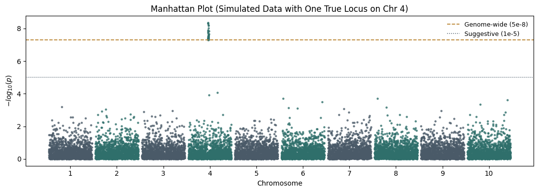
76 Manhattan Plots

QQ plots summarize the whole GWAS.

Manhattan plots show where signals occur.

Each SNP is plotted according to:

  • genomic position
  • significance

77 Why the Name “Manhattan”?

Significant loci appear as towers.

These resemble skyscrapers in Manhattan.

# Illustrative simulation -- NOT real fastGWA output.
# Simulates genome-wide p-values across 10 chromosomes with one true locus,
# to show what a real association "tower" looks like against the null background.

import numpy as np
import matplotlib.pyplot as plt

rng = np.random.default_rng(7)
n_chr, snps_per_chr = 10, 1500
true_chr, true_pos_center = 4, 700

chrom, pos, pval = [], [], []
cum_offset = 0
chrom_offsets = []

for c in range(1, n_chr + 1):
    p = np.sort(rng.integers(1, 250_000_000, snps_per_chr))
    pv = rng.uniform(0, 1, snps_per_chr)
    if c == true_chr:
        window = slice(max(0, true_pos_center - 15), true_pos_center + 15)
        pv[window] = rng.uniform(1e-10, 5e-8, len(pv[window]))
    chrom.extend([c] * snps_per_chr)
    pos.extend(p + cum_offset)
    pval.extend(pv)
    chrom_offsets.append(cum_offset + p.max() / 2)
    cum_offset += p.max() + 20_000_000

chrom, pos, pval = np.array(chrom), np.array(pos), np.array(pval)
neglog_p = -np.log10(pval)

fig, ax = plt.subplots(figsize=(11, 4))
colors_cycle = ["#2f6f6b", "#4a5a68"]
for c in range(1, n_chr + 1):
    mask = chrom == c
    ax.scatter(pos[mask], neglog_p[mask], s=5, color=colors_cycle[c % 2], alpha=0.7)
ax.axhline(-np.log10(5e-8), color="#b9812c", linestyle="--", linewidth=1.3, label="Genome-wide (5e-8)")
ax.axhline(-np.log10(1e-5), color="#4a5a68", linestyle=":", linewidth=1.1, label="Suggestive (1e-5)")
ax.set_xticks(chrom_offsets)
ax.set_xticklabels(range(1, n_chr + 1))
ax.set_xlabel("Chromosome")
ax.set_ylabel("$-log_{10}(p)$")
ax.set_title(f"Manhattan Plot (Simulated Data with One True Locus on Chr {true_chr})")
ax.legend(frameon=False, fontsize=9)
plt.tight_layout()
plt.show()

78 Constructing Manhattan Plots

The x-axis:

Chromosomal position

The y-axis:

\[ -\log_{10}(p) \]

Small p-values become tall peaks.

79 Plotting Results

par(mfrow=c(2,1))

manhattan(
  qq_noPCs,
  main="No PC Adjustment",
  suggestiveline=-log10(1e-5),
  genomewideline=-log10(5e-8)
)

manhattan(
  qq_withPCs,
  main="With PC Adjustment",
  suggestiveline=-log10(1e-5),
  genomewideline=-log10(5e-8)
)

80 Understanding the Threshold Lines

The blue line:

\[ 10^{-5} \]

is the suggestive threshold.

The red line:

\[ 5\times10^{-8} \]

is the genome-wide significance threshold.

81 Why 5×10⁻⁸?

Historically:

Approximately one million independent tests occur in a European GWAS.

Using Bonferroni correction:

\[ 0.05 / 10^6 = 5\times10^{-8} \]

This became the standard threshold.

82 What Does a True Signal Look Like?

A true causal locus rarely appears as a single SNP.

Instead:

Many nearby SNPs become significant

because of linkage disequilibrium.

Result:

Tower

rather than:

Single isolated point

83 Example

Good signal:

      *
     ***
    *****
   *******

Suspicious signal:

      *

A single isolated SNP often indicates:

  • genotyping error
  • poor imputation
  • technical artifact

84 Comparing No-PC and PC-Adjusted Results

Ask:

  1. Do significant loci remain?
  2. Do some peaks disappear?
  3. Does inflation decrease?

Possible outcome:

No PCs:
Many peaks

With PCs:
Fewer peaks

Interpretation:

Many initial hits were likely due to stratification.

85 Identifying Top Hits

Find the most significant SNPs.

top_hits <- res_withPCs[
  order(res_withPCs$P),
]

head(
  top_hits[
    ,
    c(
      "CHR",
      "SNP",
      "POS",
      "BETA",
      "SE",
      "P"
    )
  ]
)

86 Volcano Plot (Optional)

Although uncommon in GWAS, a volcano plot can visualize:

  • effect size
  • significance
plot(
  res_withPCs$BETA,
  -log10(res_withPCs$P),
  pch=20,
  col=rgb(0,0,1,0.3),
  xlab="Beta",
  ylab="-log10(P)",
  main="Volcano Plot"
)

88 Common GWAS Visualization Mistakes

88.1 Mistake 1

Reporting Manhattan plots without QQ plots.

You cannot assess inflation.

88.2 Mistake 2

Reporting λ without QQ plots.

You lose context.

88.3 Mistake 3

Ignoring isolated significant SNPs.

True loci usually form peaks.

88.4 Mistake 4

Comparing Manhattan plots from different studies without checking sample size.

Larger studies naturally produce stronger signals.

89 Study 2 Visualization

Repeat:

res2_noPCs <- read.table(
  "study2_noPCs.fastGWA",
  header=TRUE
)

res2_withPCs <- read.table(
  "study2_withPCs.fastGWA",
  header=TRUE
)

Create:

  • QQ plots
  • λ values
  • Manhattan plots

Compare:

  • Study 1
  • Study 2

before meta-analysis.

90 Summary

In this section we learned:

  1. Why GWAS visualization is essential.
  2. How QQ plots detect inflation.
  3. How λ is calculated.
  4. Why λ > 1 is not always problematic.
  5. How Manhattan plots display genome-wide associations.
  6. Why true loci form towers.
  7. How PC adjustment affects GWAS results.

At this point we have:

  • QC’d data
  • principal components
  • mixed-model GWAS results
  • visualized associations

Next we will combine Study 1 and Study 2 using METAL and perform GWAS meta-analysis.

90.0.1 Part 5: GWAS Meta-Analysis Using METAL

90.0.2 Why Meta-Analysis?

Suppose we run GWAS in:

  • Study 1 (N = 2,000)
  • Study 2 (N = 2,500)

Each study may lack sufficient power to detect small genetic effects.

Many complex traits are highly polygenic.

Most SNP effects are extremely small.

For example:

\[ \beta = 0.02 \]

may require tens of thousands of samples for reliable detection.

Instead of analyzing studies separately, we can combine evidence across studies.

This process is called:

90.0.2.1 Meta-Analysis

90.0.3 Advantages of Meta-Analysis

Meta-analysis:

  • increases sample size
  • increases statistical power
  • improves effect-size estimation
  • identifies consistent signals
  • avoids sharing individual-level genotype data

This last point is particularly important.

Many large consortia share only:

  • effect sizes
  • standard errors
  • p-values

rather than raw genotype data.

90.0.3.1 Historical Perspective

Many famous GWAS discoveries were found through meta-analysis.

Examples include:

  • GIANT Consortium (height, BMI)
  • Psychiatric Genomics Consortium (PGC)
  • CARDIoGRAM
  • DIAGRAM
  • Alzheimer’s Disease Genetics Consortium

Modern GWAS often combine:

10
20
50
100+
cohorts
90.0.3.1.1 Fixed-Effect Meta-Analysis

The simplest model assumes:

Every study estimates the same underlying genetic effect.

Suppose:

Study 1 estimates:

\[ \hat{\beta}_1 \]

with standard error:

\[ SE_1 \]

Study 2 estimates:

\[ \hat{\beta}_2 \]

with standard error:

\[ SE_2 \]

90.0.3.2 Inverse Variance Weighting

The combined effect is:

\[ \hat{\beta}_{meta} = \frac{ w_1\hat{\beta}_1 + w_2\hat{\beta}_2 } { w_1+w_2 } \]

where:

\[ w_i = \frac{1}{SE_i^2} \]

Studies with smaller standard errors receive larger weights.

90.0.3.3 Why Larger Studies Get More Weight

Large studies generally have:

  • smaller standard errors
  • more precise estimates

Therefore:

\[ SE \downarrow \Rightarrow Weight \uparrow \]

This is exactly what we want.

More reliable studies contribute more strongly.

90.0.4 What Does METAL Do?

METAL is one of the most widely used GWAS meta-analysis programs.

Input:

Summary statistics

Output:

Combined summary statistics

METAL does not require:

  • genotype data
  • phenotype data
  • individual-level covariates

Only GWAS summary statistics are needed.

90.0.4.1 Preparing GWAS Results

We previously generated:

study1_withPCs.fastGWA

study2_withPCs.fastGWA

These files contain:

  • SNP
  • chromosome
  • position
  • beta
  • standard error
  • p-value

90.0.4.2 Inspecting Results

head study1_withPCs.fastGWA

head study2_withPCs.fastGWA

90.0.4.3 Required Columns

METAL typically requires:

Column Meaning
SNP Variant identifier
A1 Effect allele
A2 Other allele
BETA Effect size
SE Standard error
P P-value

90.0.4.4 Harmonization

Before meta-analysis:

effect alleles must match.

For example:

Study 1:

A = effect allele
G = reference allele

Study 2:

G = effect allele
A = reference allele

If not corrected:

effect estimates will point in opposite directions.

This can completely invalidate results.

90.0.4.5 Example

Study 1:

\[ \beta = +0.15 \]

Study 2:

\[ \beta = -0.15 \]

The apparent disagreement may be entirely due to allele coding.

Always harmonize alleles.

90.0.4.6 Creating a METAL Script

Create:

metal_script.txt

91 Contents

SCHEME STDERR

MARKER SNP

ALLELE A1 A2

EFFECT BETA

STDERR SE

PVAL P

PROCESS study1_withPCs.fastGWA

PROCESS study2_withPCs.fastGWA

OUTFILE meta_results .

ANALYZE

QUIT

92 Understanding the Commands

92.1 SCHEME STDERR

Use inverse-variance weighting.

Weights:

\[ w_i=\frac{1}{SE_i^2} \]

92.2 MARKER

Specifies SNP identifier column.

SNP

92.3 EFFECT

Specifies effect-size column.

BETA

92.4 STDERR

Specifies standard error column.

SE

92.5 PROCESS

Loads a study.

PROCESS study1
PROCESS study2

92.6 ANALYZE

Runs the meta-analysis.

93 Running METAL

metal metal_script.txt

Output:

meta_results1.tbl

94 Inspecting Meta-Analysis Results

head meta_results1.tbl

Common columns:

Column Meaning
MarkerName SNP ID
Allele1 Effect allele
Allele2 Other allele
Effect Combined beta
StdErr Combined SE
P-value Meta-analysis p-value
Direction Sign of effect in each study

95 Understanding Direction

Example:

++

Both studies:

positive effect

Example:

--

Both studies:

negative effect

Example:

+-

Studies disagree.

This may indicate:

  • heterogeneity
  • allele issues
  • random variation

96 Why Meta-Analysis Increases Power

Suppose:

Study 1:

\[ P=10^{-4} \]

Study 2:

\[ P=10^{-3} \]

Neither reaches:

\[ 5\times10^{-8} \]

alone.

Combined analysis may produce:

\[ P=10^{-9} \]

This is why meta-analysis dominates modern GWAS.

97 Comparing GWAS and Meta-Analysis

Load results in R.

study1 <- read.table(
  "study1_withPCs.fastGWA",
  header=TRUE
)

study2 <- read.table(
  "study2_withPCs.fastGWA",
  header=TRUE
)

meta <- read.table(
  "meta_results1.tbl",
  header=TRUE
)

98 Number of Significant Hits

sum(
  study1$P < 5e-8
)

sum(
  study2$P < 5e-8
)

sum(
  meta$P.value < 5e-8
)

99 Interpretation

Typically:

Meta-analysis
>
Individual studies

in terms of discoveries.

100 Manhattan Plot of Meta-Analysis

Prepare data.

library(qqman)

meta_plot <- data.frame(
  SNP = meta$MarkerName,
  CHR = meta$Chromosome,
  BP = meta$Position,
  P = meta$P.value
)
manhattan(
  meta_plot,
  main="Meta-analysis Manhattan Plot",
  suggestiveline=-log10(1e-5),
  genomewideline=-log10(5e-8)
)

101 QQ Plot of Meta-Analysis

qq(
  meta$P.value,
  main="Meta-analysis QQ Plot"
)

102 Heterogeneity

One of the most important concepts in meta-analysis is:

102.1 Heterogeneity

Suppose:

Study 1:

\[ \beta = 0.20 \]

Study 2:

\[ \beta = 0.18 \]

These are consistent.

Now suppose:

Study 1:

\[ \beta = 0.25 \]

Study 2:

\[ \beta = -0.20 \]

These are inconsistent.

This is heterogeneity.

103 Cochran’s Q Statistic

Many meta-analysis tools evaluate:

\[ Q = \sum w_i ( \beta_i-\beta_{meta} )^2 \]

Large Q values indicate disagreement among studies.

104 I² Statistic

Another common metric:

\[ I^2 = 100\% \times \frac{Q-df}{Q} \]

Interpretation:

Meaning
0% No heterogeneity
25% Low
50% Moderate
75% High

105 Why Heterogeneity Matters

Heterogeneity may arise from:

  • ancestry differences
  • environmental differences
  • phenotype definitions
  • technical differences
  • gene-environment interaction

106 Mystery Phenotype Investigation

The workshop asks:

Can we identify the phenotype from the strongest GWAS hit?

Procedure:

  1. Find the top SNP.
top_snp <- meta[
  which.min(meta$P.value),
]

top_snp
  1. Record:
rsID
  1. Search:
  • GWAS Catalog
  • Ensembl
  • dbSNP
  • Open Targets Genetics
  1. Compare previously reported traits.

This often provides clues regarding phenotype identity.

107 Example Resources

Useful databases:

108 Summary

In this section we learned:

  1. Why GWAS meta-analysis is necessary.
  2. How inverse-variance weighting works.
  3. How METAL combines studies.
  4. Why allele harmonization matters.
  5. How to interpret meta-analysis results.
  6. How heterogeneity is assessed.
  7. Why meta-analysis increases power.
  8. How to identify candidate phenotypes using top SNPs.

At this point we have completed:

  • QC
  • PCA
  • GRM construction
  • fastGWA analysis
  • QQ plots
  • Manhattan plots
  • Meta-analysis

The final section will focus on:

  • inspecting relatedness directly from the GRM
  • identifying relatives
  • interpreting GRM values
  • understanding cryptic relatedness
  • best practices for large-scale GWAS.

108.0.1 Part 6: Understanding Relatedness, GRMs, and Best Practices for GWAS

108.0.1.1 Why Relatedness Matters

One of the fundamental assumptions of classical statistical tests is:

Observations are independent.

In genetic studies this assumption is often violated.

Individuals may be:

  • siblings
  • parent-child pairs
  • cousins
  • twins
  • members of the same pedigree

These relationships introduce correlation.

If ignored, GWAS statistics become inflated.

108.0.1.2 What is Cryptic Relatedness?

Cryptic relatedness means:

Individuals are genetically related, but the relationship is unknown or unrecorded.

Examples:

  • unknown cousins
  • undocumented family relationships
  • pedigree errors
  • duplicate samples

Large biobanks often contain thousands of related individuals.

108.0.1.3 Historical Perspective

Early GWAS often removed relatives.

Modern GWAS typically retain relatives and use mixed models.

Why?

Because removing relatives wastes valuable samples.

Mixed models allow us to:

  • retain individuals
  • model relatedness directly
  • increase statistical power

108.0.1.4 Revisiting the Genetic Relationship Matrix

The GRM contains pairwise genetic similarity.

Suppose we have:

\[ N \]

individuals.

The GRM contains:

\[ N\times N \]

entries.

Each cell represents:

How genetically similar are two individuals?

108.0.1.5 GRM Interpretation

Suppose:

ID1 ID2 Relationship

produces:

0.50

Interpretation:

Likely:

  • parent-child
  • full siblings

Suppose:

0.25

Interpretation:

Likely:

  • half siblings
  • grandparent-grandchild
  • avuncular relationships

Suppose:

0.125

Interpretation:

Likely:

  • first cousins

Suppose:

0.00

Interpretation:

Essentially unrelated.

108.0.1.6 Typical Relatedness Thresholds

GRM Value Interpretation
>0.95 Duplicate sample / identical twin
~0.50 Parent-child or sibling
~0.25 Second-degree relative
~0.125 First cousin
~0 Unrelated

These values are approximate.

Real data fluctuate around expectations.

108.0.1.7 Reading the GRM

We previously generated:

study1_grm

using:

gcta64 \
  --bfile study1_qc \
  --make-grm \
  --out study1_grm

Convert GRM to text:

gcta64 \
  --grm study1_grm \
  --grm-cutoff 0 \
  --make-grm-gz \
  --out study1_grm_text

This produces:

study1_grm_text.grm.gz

Inspect:

zcat study1_grm_text.grm.gz | head

108.0.1.8 Understanding GRM Columns

Typical output:

ID1
ID2
N_SNP
GRM

Meaning:

Column Description
ID1 Individual 1
ID2 Individual 2
N_SNP Number of SNPs used
GRM Relatedness estimate

108.0.1.9 Finding Close Relatives

Extract individuals with:

\[ GRM > 0.05 \]

zcat study1_grm_text.grm.gz \
| awk '$4 > 0.05'

These are genetically related pairs.

108.0.1.11 Identifying Duplicates

Potential duplicates:

zcat study1_grm_text.grm.gz \
| awk '$4 > 0.95'

Interpretation:

Possible:

  • duplicated sample
  • monozygotic twins
  • sample labeling error

These should be investigated.

108.0.1.12 Visualizing the GRM

Switch to R.

library(data.table)

grm <- fread(
  "study1_grm_text.grm.gz"
)

108.0.1.13 Heatmap of Relatedness

library(ggplot2)

ggplot(
  grm,
  aes(
    x=V1,
    y=V2,
    fill=V4
  )
)+
geom_tile()+
scale_fill_gradient(
  low="white",
  high="red"
)+
theme_minimal()+
labs(
  title="Genetic Relationship Matrix"
)

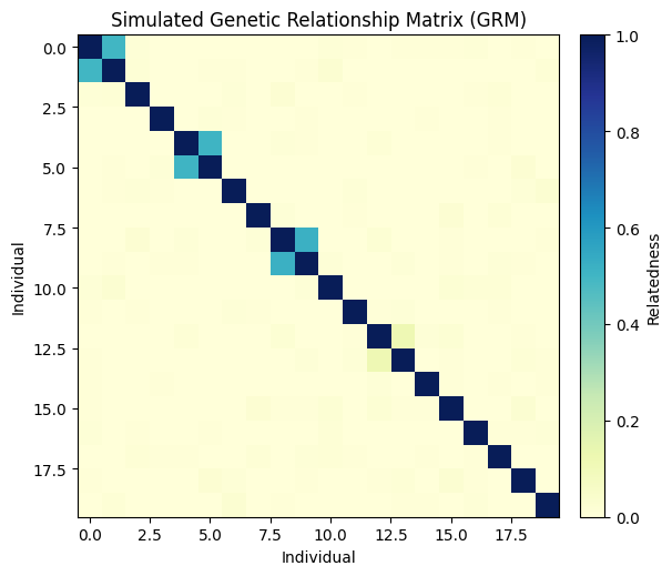
108.0.1.14 Interpretation

Bright red regions indicate:

  • families
  • clusters of relatives

White regions indicate:

  • unrelated individuals
# Illustrative simulation -- NOT a real GRM from GCTA.
# Simulates a small GRM for 20 individuals including two sibling pairs,
# one parent-child pair, and one first-cousin pair, to make the heatmap
# and "finding close relatives" discussion concrete.

import numpy as np
import matplotlib.pyplot as plt

rng = np.random.default_rng(42)
n_ind = 20
grm = np.zeros((n_ind, n_ind))
np.fill_diagonal(grm, 1.0)
base_noise = rng.normal(0, 0.015, (n_ind, n_ind))
grm += (base_noise + base_noise.T) / 2
np.fill_diagonal(grm, 1.0)

sib_pairs = [(0, 1), (4, 5)]
for i, j in sib_pairs:
    grm[i, j] = grm[j, i] = 0.5 + rng.normal(0, 0.02)
grm[8, 9] = grm[9, 8] = 0.5 + rng.normal(0, 0.02)          # parent-child
grm[12, 13] = grm[13, 12] = 0.125 + rng.normal(0, 0.02)    # first cousins

fig, ax = plt.subplots(figsize=(6, 5.3))
im = ax.imshow(grm, cmap="YlGnBu", vmin=0, vmax=1)
ax.set_title("Simulated Genetic Relationship Matrix (GRM)")
ax.set_xlabel("Individual")
ax.set_ylabel("Individual")
cbar = fig.colorbar(im, ax=ax, fraction=0.046, pad=0.04)
cbar.set_label("Relatedness")
plt.tight_layout()
plt.show()

close_pairs = [(i, j, round(grm[i, j], 3))
               for i in range(n_ind) for j in range(i + 1, n_ind)
               if grm[i, j] > 0.05]
print("Detected close-relative pairs (GRM > 0.05):", close_pairs)

Detected close-relative pairs (GRM > 0.05): [(0, 1, np.float64(0.496)), (4, 5, np.float64(0.504)), (8, 9, np.float64(0.516)), (12, 13, np.float64(0.117))]

108.0.1.15 Relatedness Distribution

hist(
  grm$V4,
  breaks=100,
  main="GRM Distribution",
  xlab="Relatedness"
)

108.0.1.16 Expected Pattern

Most individuals should be:

Near zero

A small number should show:

0.125
0.25
0.5

indicating relatives.

108.0.2 Relationship Categories

Create categories.

grm$relationship <- cut(
  grm$V4,
  breaks=c(
    -Inf,
    0.05,
    0.125,
    0.25,
    0.5,
    Inf
  ),
  labels=c(
    "Unrelated",
    "Distant",
    "First Cousin",
    "Second Degree",
    "First Degree"
  )
)

table(
  grm$relationship
)

108.0.2.1 Why Relatedness Creates False Positives

Suppose:

  • siblings share 50% of genome
  • siblings share environmental exposures

Phenotypes become correlated.

A SNP inherited within families may appear associated with the trait simply because family members resemble each other.

This creates inflation.

108.0.3 Classical Solution

Older GWAS often removed relatives.

Example:

plink \
  --bfile study1_qc \
  --rel-cutoff 0.125 \
  --make-bed \
  --out study1_unrelated

This removes one individual from each related pair.

109 Disadvantages

You lose data.

Example:

20,000 samples

may become:

14,000 samples

after removing relatives.

Power decreases.

110 Modern Solution

Use:

Linear Mixed Models

Examples:

  • fastGWA
  • BOLT-LMM
  • SAIGE
  • REGENIE

These methods:

  • keep relatives
  • model relatedness directly

This is why modern biobanks rarely remove all relatives.

111 Comparing Approaches

Approach Relatives Removed?
PLINK Linear Regression Usually yes
Mixed Models No
fastGWA No
BOLT-LMM No
REGENIE No

112 Why Biobanks Need Mixed Models

Consider:

112.0.1 UK Biobank

Approximately:

500,000 individuals

Contains:

Tens of thousands
of related individuals

Removing all relatives would waste enormous amounts of data.

Mixed models solve this problem.

113 GWAS Best Practices Checklist

Before running GWAS:

113.1 Sample QC

✔ Missingness

✔ Sex checks

✔ Heterozygosity

✔ Relatedness

113.2 SNP QC

✔ Missingness

✔ MAF filtering

✔ HWE filtering

113.3 Population Structure

✔ PCA

✔ Ancestry inspection

113.4 Association Analysis

✔ Mixed model

✔ GRM

✔ PCs as covariates

113.5 Visualization

✔ QQ plot

✔ Lambda

✔ Manhattan plot

113.6 Replication

✔ Independent cohort

or

✔ Meta-analysis

113.6.1 Common Beginner Mistakes

113.6.2 Mistake 1

Running GWAS without QC.

113.6.3 Mistake 2

Ignoring population structure.

113.6.4 Mistake 3

Ignoring relatedness.

113.6.5 Mistake 4

Using only p-values.

Effect sizes matter.

113.6.6 Mistake 5

Reporting isolated SNPs without checking LD.

113.6.7 Mistake 6

Assuming genome-wide significance proves causality.

GWAS identifies association, not causation.

113.6.7.1 What Happens After GWAS?

A significant GWAS hit is only the beginning.

Typical follow-up analyses include:

  • Fine mapping
  • Colocalization
  • eQTL analysis
  • TWAS
  • Polygenic Risk Scores
  • Mendelian Randomization
  • Functional annotation

113.6.8 Complete GWAS Workflow

You have now completed the entire GWAS pipeline:

Raw Genotypes
      ↓
Quality Control
      ↓
LD Pruning
      ↓
PCA
      ↓
GRM Construction
      ↓
Mixed Model GWAS
      ↓
QQ Plot
      ↓
Manhattan Plot
      ↓
Meta-analysis
      ↓
Relatedness Inspection
      ↓
Biological Interpretation

A GWAS is much more than running a regression for millions of SNPs.

Every stage exists for a reason:

  • QC prevents technical artifacts.
  • PCA controls ancestry differences.
  • GRMs model genetic similarity.
  • Mixed models account for relatedness.
  • QQ plots diagnose inflation.
  • Manhattan plots reveal genomic loci.
  • Meta-analysis increases power.

When all of these pieces work together, GWAS becomes one of the most powerful tools in modern human genetics, enabling the discovery of thousands of genetic variants associated with disease, behavior, physiology, and molecular traits.